


People are turning to their mobile devices more and more these days. This is the reason Google has started ranking websites that are mobile-friendly higher on their search engine results pages.
If your website isn’t mobile-friendly, or responsive, it’s time to make it that way. It’s not too difficult if you have a WordPress website.
Why Do It
Before I get into the nitty-gritty of why you need to make your website friendly to mobile devices, let me tell you why.
If you’ve ever been on a site on your smartphone, you know what it looks like. The text doesn’t fit on the screen, so you can’t read it. The pictures are cut off. You probably can’t even use the drop-down menu. Oh, and something else that happens sometimes, you’ll see the entire site but it will have micro size font on it.
How frustrating, right?
Your users do not want to deal with a website that isn’t pleasing to the eyes. When users don’t want to deal with your site, you lose business. That’s why you need to make your website mobile-friendly.
Upgrading to a Responsive Theme Design
Websites should be updated every couple of years. The Internet is changing too rapidly to keep a website the same for more than two years.
So, if your site is older than two years, you need a new theme.
The good news for you is that all themes are responsive these days because no one is going to want one that is non-responsive to mobile devices. Simply choose one in WordPress’ directory or search for one using Google. Many paid and free options are available.
For those of you who want to keep the same website design, reach out to the developer of your site. He should have made an update for your theme making it responsive.
Some developers go out of business, so you may have trouble getting an update. In this case, you can always hire a WordPress developer to use a primer on your site. This will make it responsive and keep your current theme intact. It’s not the cheapest route to go, but it will achieve your goal of keeping the site as is.
You can try a plugin as well. Just beware of them because some people have encountered functionality issues with their site after using them.
Some options for mobile-friendly conversion plugins are:
Optimize Images for Mobile Devices
Images make up a large chunk of your website. It also slows it down a bunch.
It’s crucial that you optimize images for mobile devices. This means that it will shrink it down to the size of the device the users are using when loading your website.
Check out our other blog on how to optimize images on WordPress.
Testing Out a Site for Mobile-Friendliness
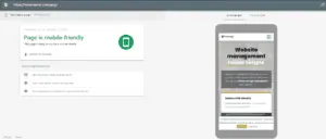
It’s easy to test your site for how mobile-friendly it is – just go to Google’s Mobile-Friendly Test tool.
It will tell you whether your site is responsive.
As you can see Webmaster Company’s site is:
Need Help Making Your Website Mobile-Friendly?
If you need help making your website mobile-friendly, do not hesitate to contact Patrick.
He has the knowledge and skills to redesign your website or make your current design responsive.
Contact him today for more information on how he can make that happen for you.